As an undergraduate engineering student many years ago, I recall being taught about fundamental concepts through the use of diagrams and charts. Following on from my post last week, I felt it important to dig into the way we use images and other graphical tools to communicate.
As a PhD student in London, I was combining a range of physics in computational fluid dynamics (CFD) modelling. It is a powerful tool based on the flow of fluids – liquids and gases. The visualisation tools allow the flow fields and other parameters such as temperature and composition to be examined to gain insight into what is happening.
Looking at hydraulic flows like a spillway, or a channel, the surface velocity is very much different to what is underneath.
Also this looks so realistic, but is actually an AI generated image!

Fast forward past going back to working on site for BHP at Olympic Dam copper smelter in the middle of Australia and then working in consulting I came across the terms of “Colourful Fluid Dynamics” and “Colour for Directors”. These colloquial sayings in the CFD fraternity were termed to indicate that due to the pretty pictures anyone would believe the results – without understanding what validation and other good practices have been applied. Check out this blog on Siemens Simcentre for some more background https://blogs.sw.siemens.com/simcenter/Colorful-Fluid-Dynamics-Say-it-again-I-dare-you/
What these sayings demonstrate is that people are generally more comfortable with graphical representations and understand if we can provide a picture or even a flow chart to illustrate a point. As experts in a particular field, it is so easy to jump to the final answer without taking our clients on the journey and explaining how we got there. Think about describing your process or result in words and then think about how a graphic or image would work.

Using a flowchart to demonstrate what a calculation or a business process consists of is generally more powerful than describing in text.
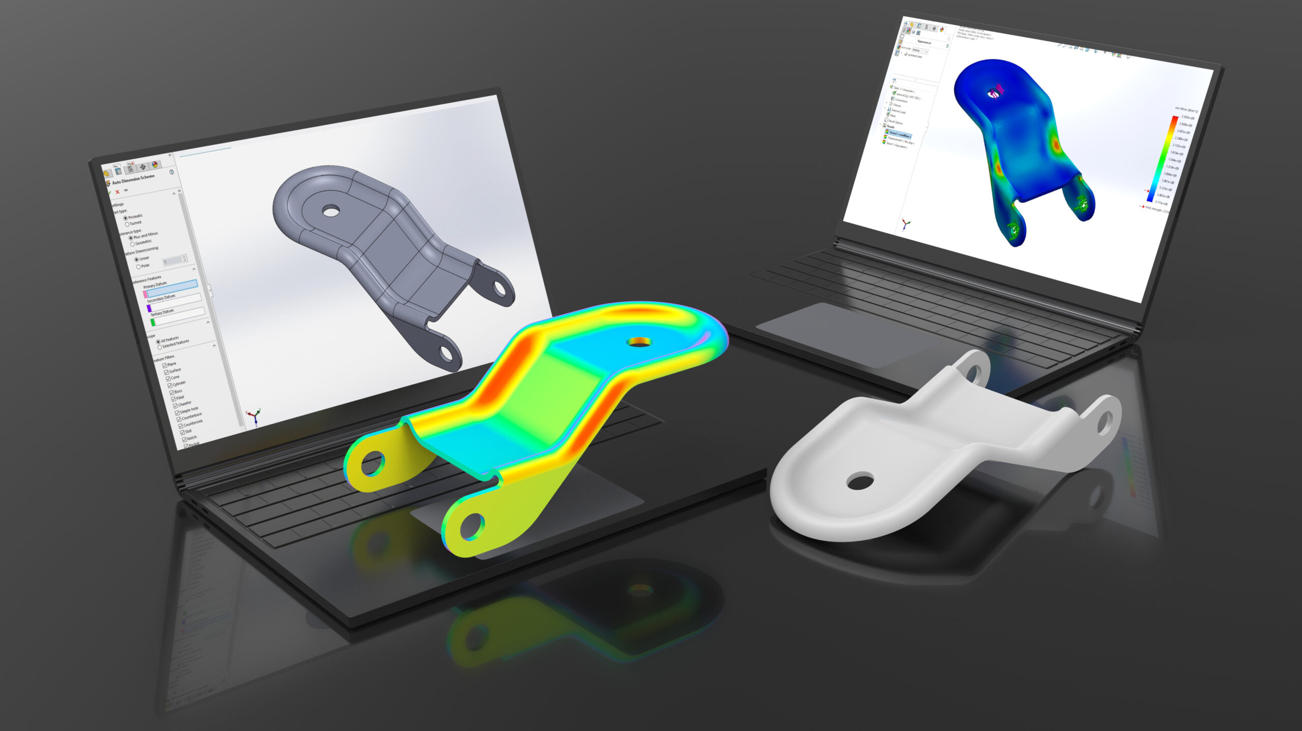
In a lot of the simulation work I have been involved with over many years, clients find the use of diagrams, visuals and graphs helpful in understanding the trends in models and results. A lot of clients can better associate their understanding and experiences with what they are seeing to build their confidence in the results.
In a lot of occasions full testing and verification (and comparison to the limited measurements of existing plant/equipment/flows) is not practical, costly and time consuming – this is the value of simulation. As with all technology it is not fool proof, and getting feedback from peers and clients is important quality assurance process which is assisted by the graphical visualisation that can be created.
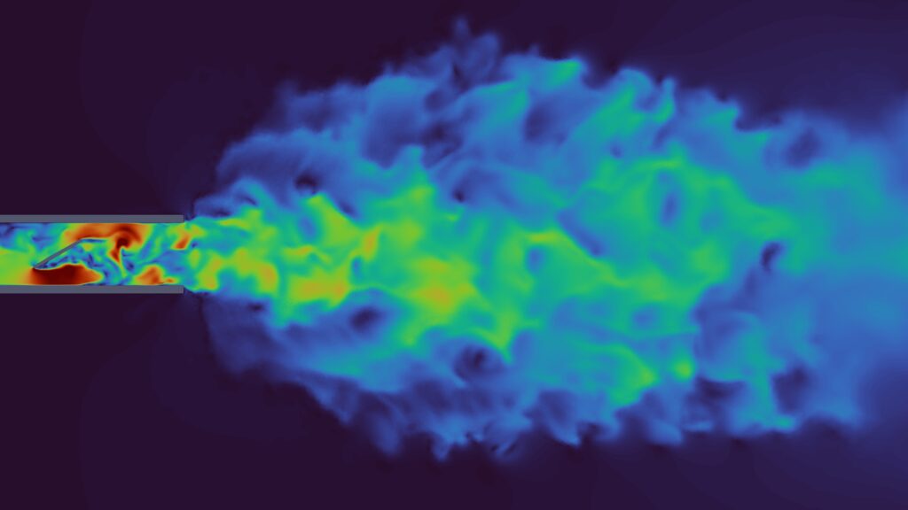
Turbulence is a classic flow phenomena that in physical testing in labs uses smoke and lasers to measure. In CFD we can show the variations in flow due to turbulent eddies.
In closing it is always important to remember what the key question that is being asked – this is helpful as in some instances capturing the right data to generate a visual takes some planning and forethought. I have re-run many simualtions when not thinking about this…. as it is not always possible to save all the data from models.
Comments are closed